GirlSpring App
iOS App Design
UI/UX | Summer 2019
During Summer 2019, I was commissioned to design a mobile app for GirlSpring, which is an online media publication empowering teenage girls. From May to August, I communicated closely with the GirlSpring founder to preserve the website’s design while maintaining key features. At the end of the summer, I presented my designs to Motion Mobs, a local development studio that put the app into production.
The Adobe XD prototype is visible here.
Initial Observations
Website Critique
First, I analyzed the GirlSpring website to determine which features I wanted to keep/change.
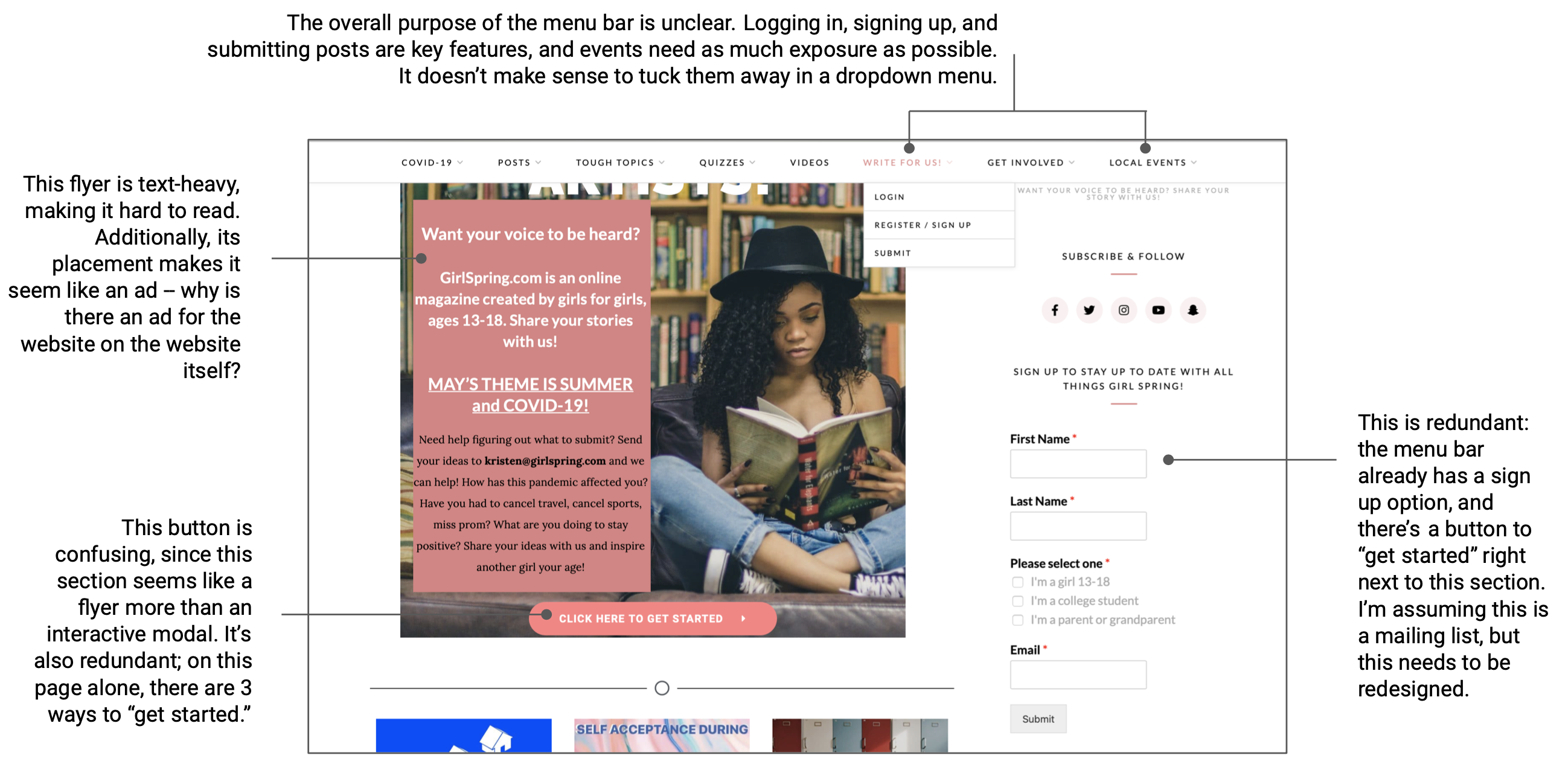
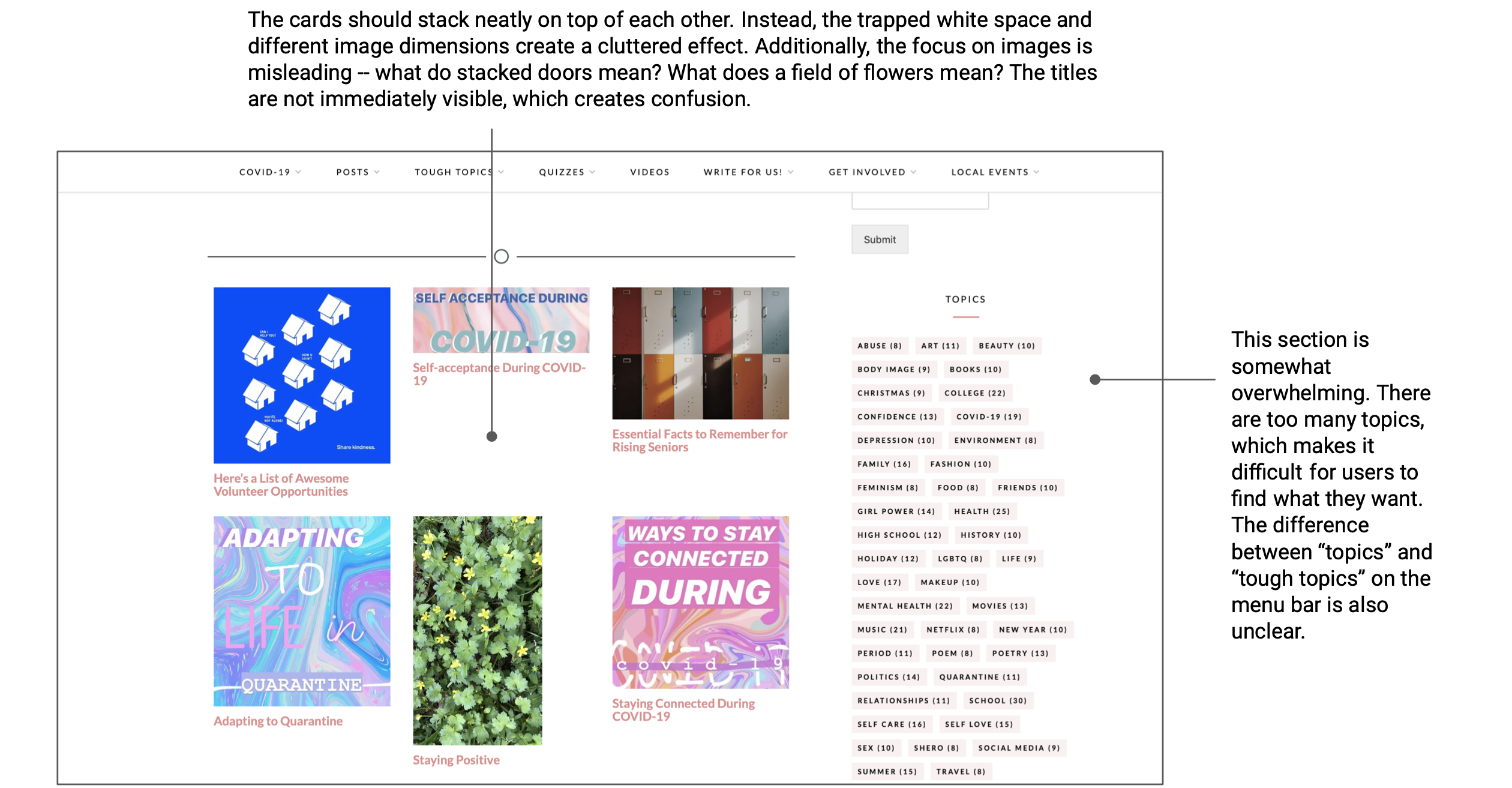
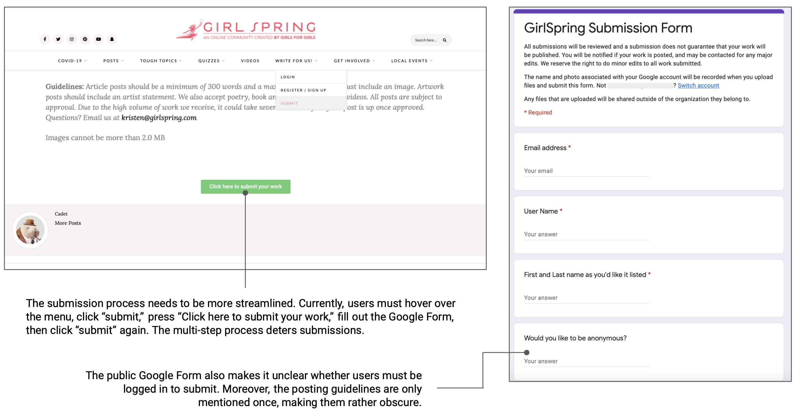
The main observations I found were:
- The menu bar is too bulky.The website is chock-full of functionality, such as filtering by topic and categorizing by mediums. However, it's much too bulky for a mobile interface, and it's harder to navigate on smaller screens.
- The main layout is unorganized.The card layout looks clean and modern, but it’s difficult to determine how articles are organized. Additionally, each card is a different dimension due to varying image sizes, and the website is divided such that it's difficult to discern where one section ends and another begins.
- The submission process is confusing.The heart of GirlSpring lies in people's ability to submit content. However, the submission process is rather convoluted (separate Google Form, unclear guidelines), making it less likely for people to submit.
Research and Analysis
Background Research
After my initial observations, I conducted research into apps from other media publications.
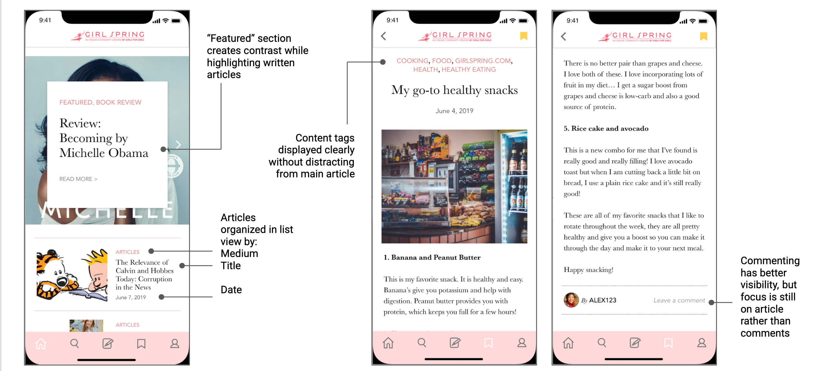
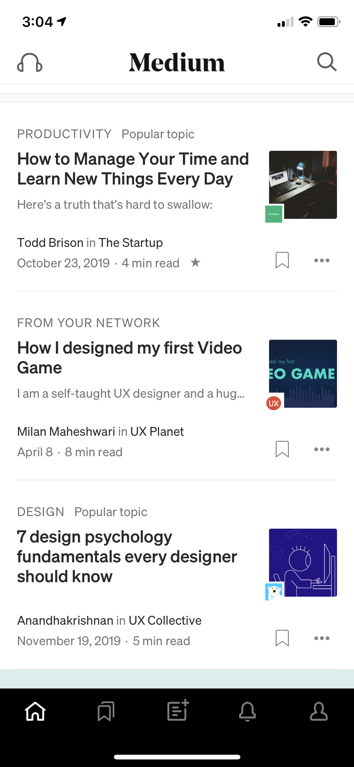
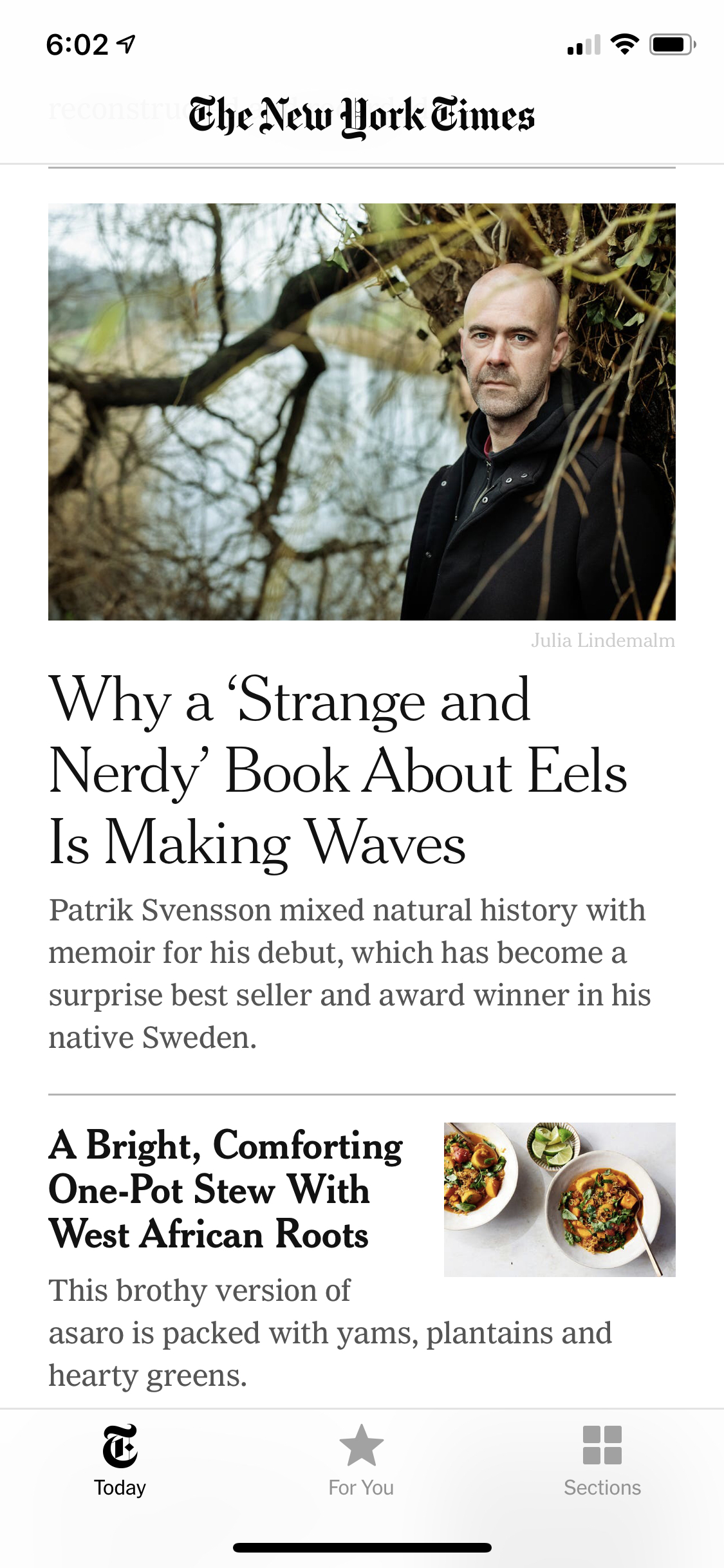
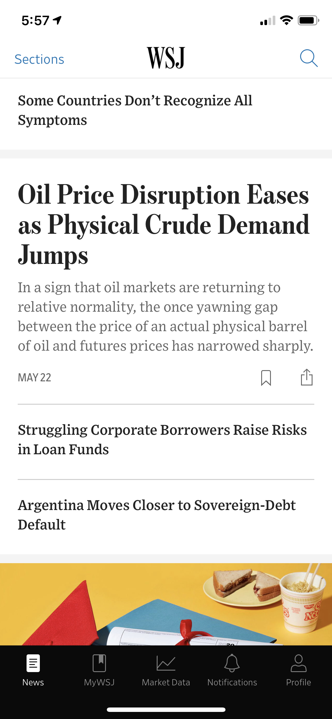
I liked Buzzfeed’s quiz layouts, which were straightforward and engaging. Medium’s navigation bar did a great job picking out key functionality. I also enjoyed the layout of news apps like The New York Times and The Wall Street Journal: featured pieces contrasted with other articles, making for visually engaging design.
Audience Analysis
Then, I analyzed my target audience. I knew they were teenage girls ages 13-18, and most of them enjoyed reading, writing, and various forms of art. According to Kristen — the founder of GirlSpring — quizzes generated the most traffic, but she wanted to put more of a focus on written articles. Therefore, I knew the final design would have to have a great UI/UX for quizzes while highlighting written articles.
Goals
After critiquing the website, conducting background research, and analyzing my audience, I created a list of key features I wanted in the final product:
- A navigation bar
- User profiles with user-to-user interaction (similar to social media profiles)
- Complementary design theme to the website
- A focus on written articles, including a “featured articles” section on the main page
- Organization by both subjects and article type
- A bookmarking option
- Easier submission process, possibly with in-app drafting ability
Design
Lo-Fi Wireframes
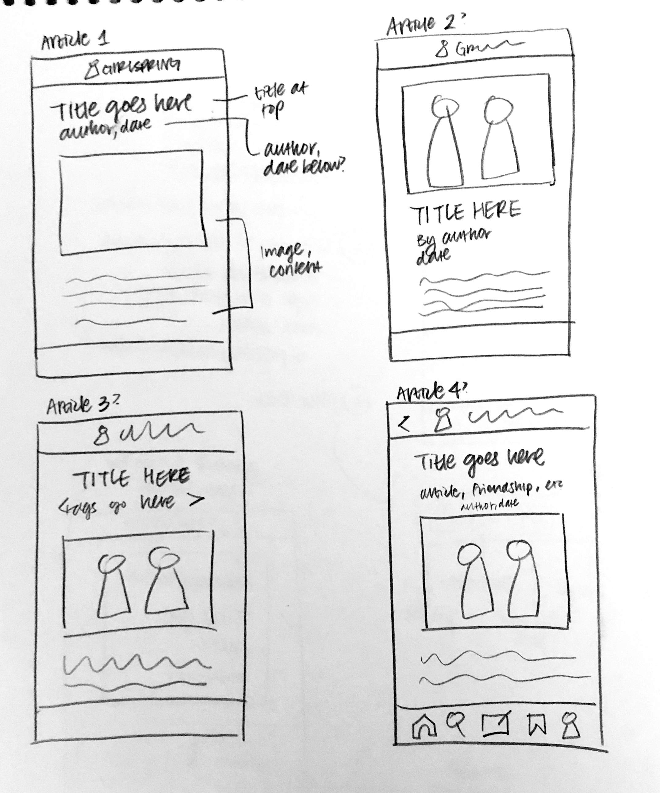
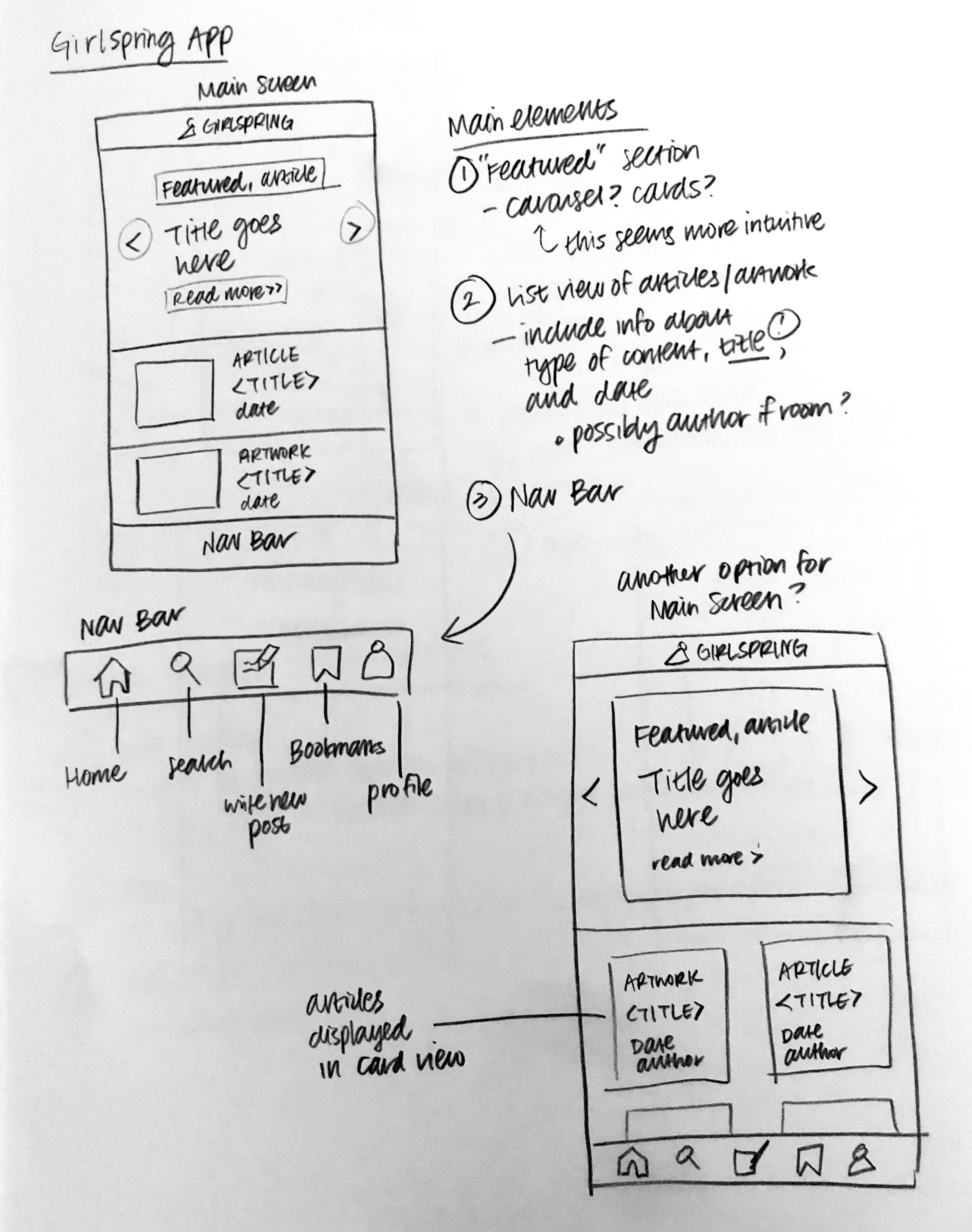
Features
Article Layout
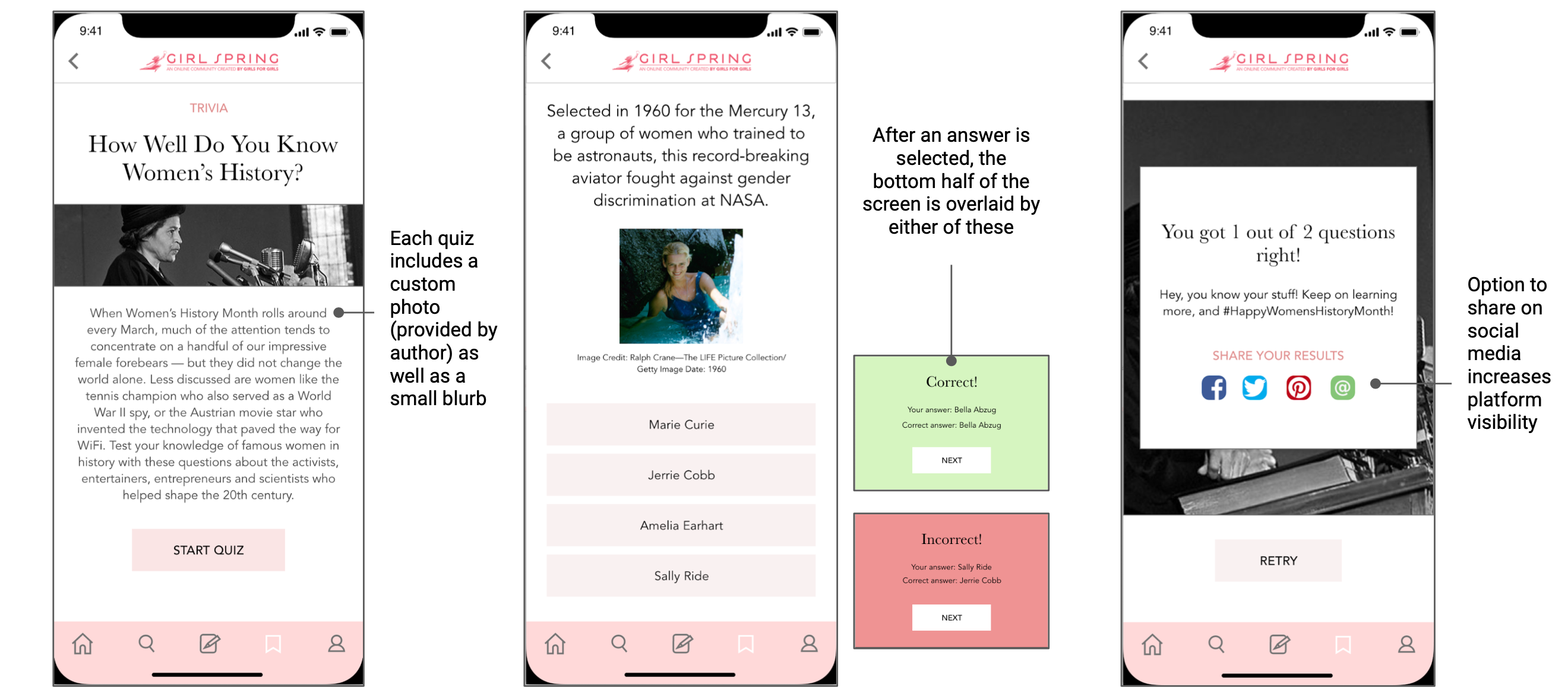
For the home page, I drew from my background research to combine Medium’s functionality with the clean, professional look of news apps like The New York Times and The Wall Street Journal. I also included a “Featured” carousel to highlight written articles, and I shifted the focus from article images to article titles.
Organization
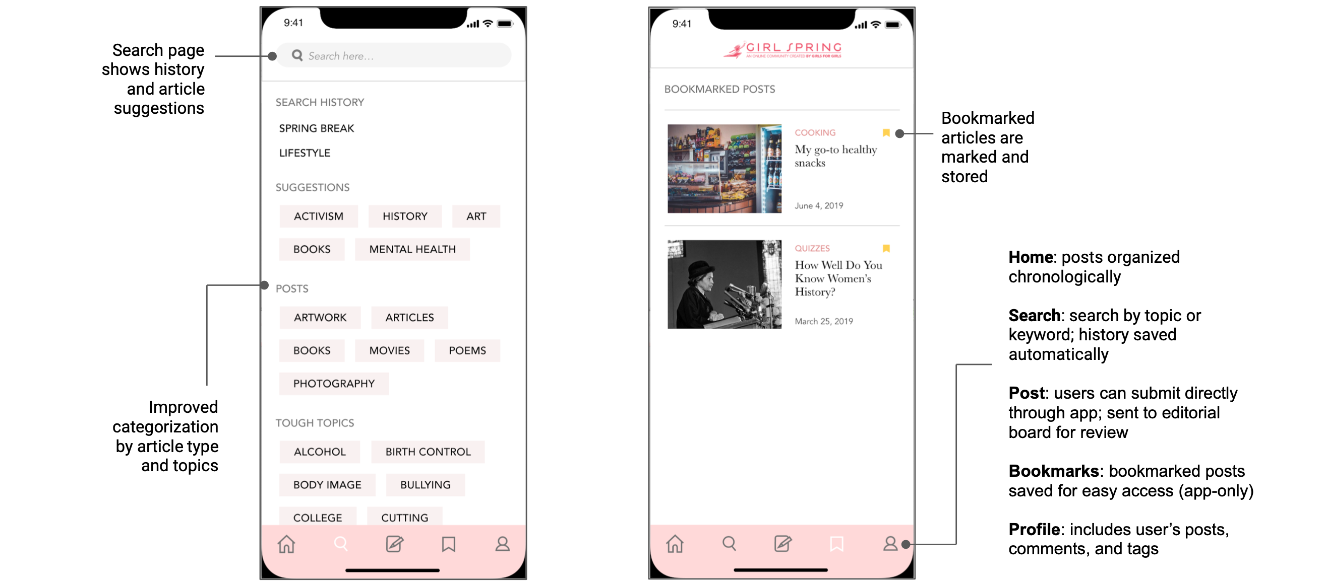
I really liked how the website filtered content by both topic and medium, so I cleaned up the tagging process for the app. On the search page, I included categorization by both article type and topics, and I displayed tags alphabetically. This increased readability while maintaining the site’s original organization system.
Streamlined Submission
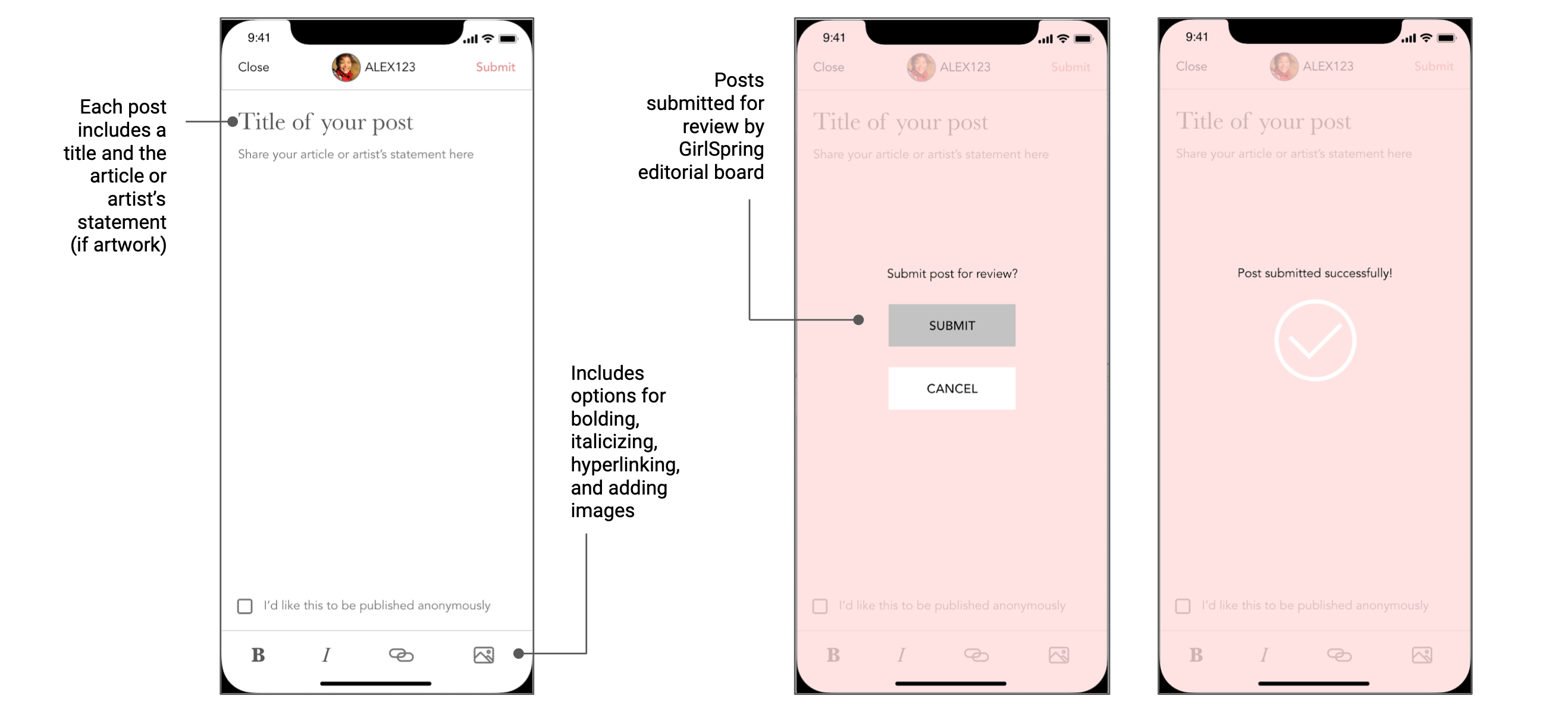
One of my main goals was to streamline the submission process. Thus, I integrated an in-app drafting feature to help users create and submit in the same space. Users can attach images, include hyperlinks, or post anonymously, bypassing the need for a separate submission form.
Individual Profiles
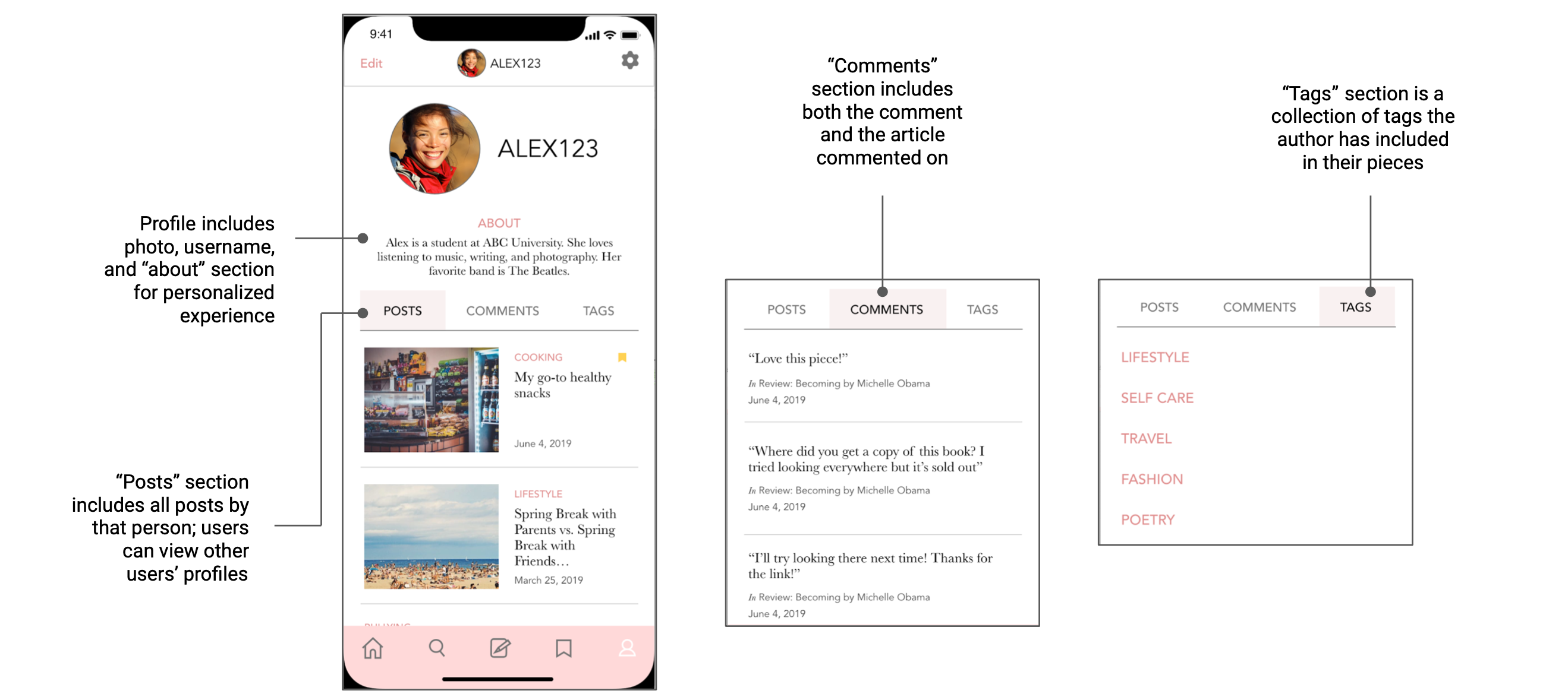
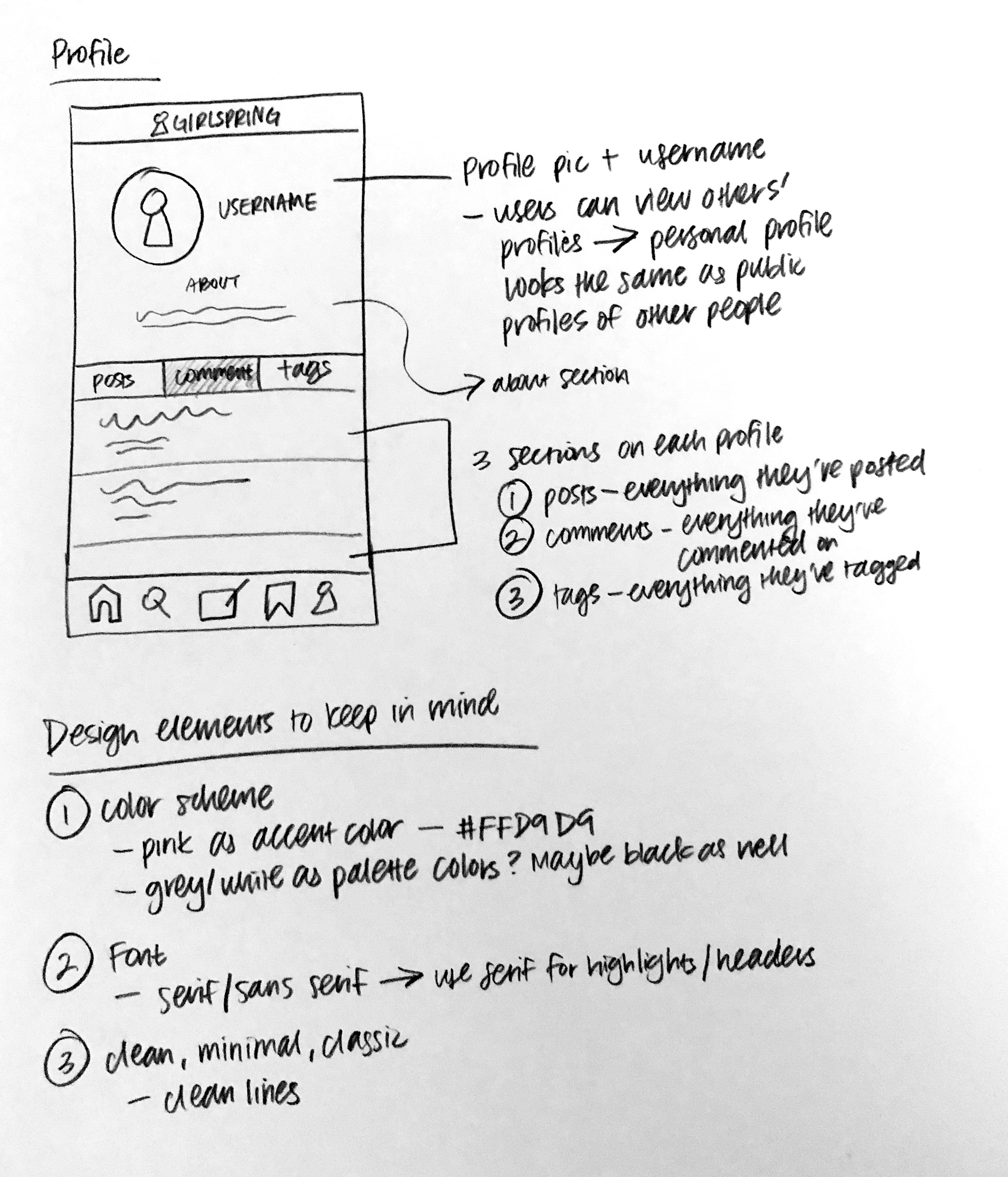
I wanted the app to feel customized for each user, so I included a profile section in the navigation bar. Each profile has a collection of posts, comments, and tags, and users can visit other users’ profiles. Additionally, I highlighted user-to-user interactions (such as comments) to make the GirlSpring platform feel more personal.
Bookmarking
One feature I noticed in other media apps was the ability to save articles. I felt this would be a good addition to the GirlSpring app, especially since new content is generated constantly (which pushes down older content, making them harder to find). I thus included a separate page in the navigation bar for bookmarked articles, allowing users to save pieces resonating with them.
Complementary UI
I loved the overall theme of the website: clean and modern, with elegant lines. I wanted to integrate design elements to make the app feel like an accompaniment to the website rather than a standalone product, so I pulled the same shade of pink from the website. Additionally, I used grey and white to complement the accent color, and I utilized similar serif/sans serif fonts.
Conclusion
Through this project, I gained a better understanding of the UI/UX design process. I learned to critique websites from a designer’s point of view, looking at every detail from menu bars to card layouts.
The greatest challenge was staying true to the site while building a separate identity for the app. I knew the app needed new features — otherwise, there would be no reason to download it — but I didn’t want to stray unrecognizably far. I realized the best solution was to identify key functions from the website, take note of thematic elements, and then build the design from there.
Overall, this project was a great chance to practice UI/UX design professionally. Kristen was amazing to work with, and I’m so thankful to the GirlSpring team for this opportunity. I hope users like using the app as much as I loved designing it!
